
A SMALL INTRO TO TAILWINDCSS

Written by Nico Proto
Feb 20 · 7 min read
Intro
In this small intro, I will help you understand how to think in TailwindCSS. We’ll go through a small theory intro 🤓(sorry in advance) and will jump next to a more hands-on 👋 exercise to practice what we learned.
Why use Tailwind
- Simple and specific: Most of the utilities included have specific functionality and don’t add extra styling to them (contrary to Bootstrap).
- Highly customizable: Although it has a default configuration, we can simply override it in the
tailwind.config.jsfile. - Can be optimized: We can use PurgeCSS in production to remove any classes we don’t use from Tailwind, only loading utilities we use.
- Easy to write: As soon as you get used to it, it becomes super fast to write your CSS classes; you can also group classes into components by using
@apply. - other reasons
Some comments before we start
- TailwindCSS doesn’t have JavaScript included, it is pure CSS. So if we want to make things dynamic we need to write our own JavaScript.
- I will assume you know the basics of CSS 😄.
- We won’t go through the installation of TailwindCSS, for that feel free to check their installation guide.
- File locations are considered for Ruby on Rails.
Configuration file
TailwindCSS configuration lives in a file called tailwind.config.js. In this file, we can customize every TailwindCSS variable.
How TailwindCSS works
- Utility Classes: As with most frameworks, TailwindCSS uses utility classes to style HTML elements; its naming convention is super intuitive (
text-center,font-bold, etc.). - Prefixes: We can add prefixes on different classes to make them work conditionally on different breakpoints or states.
For example:
_hover:font-bold_will change the font of the element to bold when hovered.
Prefixes
Responsive Design (see docs)
On TailwindCSS classes we can add a breakpoint prefix which will make it work conditionally at different breakpoints.
Usage
<div class="md:w-92 lg:w-40">
  [...]
<div class="sm:text-center lg:text-left">
Hover, Focus & other states
As with the responsive design, we can use prefixes to style different states of our elements.
Usage
<button class="bg-purple-600 hover:bg-purple-800">
  Sign up
</button>
Utility Classes
Writing TailwindCSS utility classes keeps the same structure among most CSS properties. We’ll go through some examples to clarify how the structure works, but feel free to find any specific utility class on their amazing documentation.
Fonts
Font Family → font-family → font-{type}
<p class="font-sans ...">
<p class="font-serif ...">
<p class="font-mono ...">
Note: font-sans, font-serif and font-mono are variables that we can change in our config file to the font-family of our choice.
Font Size → font-size → text-{size}
<p class="text-xs ...">The quick brown fox ...</p>
<p class="text-xl ...">The quick brown fox ...</p>
Font Weight → font-weight → font-{weight}
<p class="font-bold ...">The quick brown fox ...</p>
<p class="font-thin ...">The quick brown fox ...</p>
Text Align → text-align → text-{alignment}
<p class="text-left ...">Lorem ipsum dolor sit amet ...</p>
<p class="text-center ...">Lorem ipsum dolor sit amet ...</p>
Container
The container class will fix the element width depending on the current breakpoint.
Container → width
<div class="container">
  <!-- ... -->
</div>
Margin & Padding
Margin → margin → m{direction}-{size}
<div class="mt-8 ...">mt-8</div>
<div class="m-5 ...">m-5</div>
Left + Right → mx
Top + Down → my
Padding → padding → p{direction}-{size}
<div class="pb-3 ...">pb-4</div>
<div class="py-2 ...">py-2</div>
Left + Right ⇒ px
Top + Down ⇒ py
Colors
The color class utilities allow us to use the same kind of syntax to style different properties.
{property}-{color}-{value}
<p class="text-purple-600 ..."></p>
<button class="bg-green-500 ...">Button</button>
<input class="border-2 border-red-500 ...">
Width and Height
Height → height → h{direction}-{size}
<div class="h-12 ..."></div>
<div class="h-16 ..."></div>
Width → width → w{direction}-{size}
<div class="w-20 ..."></div>
<div class="w-28 ..."></div>
Display
No rocket science here, just classes that apply different display properties.
flex → display: flex
inline-block → display: inline-block
hidden → display: none
Creating components (see more)
Sometimes when repeating classes over and over on the same elements (buttons, avatars, etc.), it’s better to refactor our code creating components that help us to update and reuse our code.
TailwindCSS includes the @apply directive that extracts common utility patterns to CSS component classes.
.btn-indigo {
  @apply py-2 px-4 bg-indigo-500 text-white font-semibold rounded-lg shadow-md hover:bg-indigo-700 focus:outline-none focus:ring-2 focus:ring-indigo-400 focus:ring-opacity-75;
}
<button class="btn-indigo">
  Click me
</button>
TailwindCSS also recommends wrapping the styles where we use @apply with @layer components { } so it can recognize that those styles belong to the components(performance and organization reasons).
| @layer components { | |
| .btn-indigo { | |
| @apply py-2 px-4 bg-indigo-500 text-white font-semibold rounded-lg shadow-md hover:bg-indigo-700 focus:outline-none focus:ring-2 focus:ring-indigo-400 focus:ring-opacity-75; | |
| } | |
| } |
Enough theory! Let’s create a Components Kitchen Sink
_Note: We will be working on an already created Ruby on Rails app with TailwindCSS using the amazing boilerplate BambooSticks 😉.

Main Header
Let’s start styling our main header.

<h1 class="text-5xl font-semibold text-center">Kitchen Sink</h1>
What utilities did we use?
text-5xl→font-sizeandline-heightfont-semibold→font-weighttext-center→text-align
Container
Now let’s add a simple container so we can center our components later.
| <div class="container m-auto"> | |
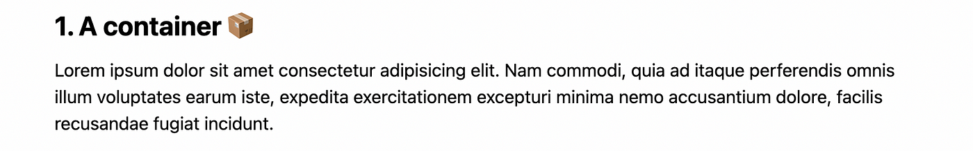
| <h2 class="text-2xl font-semibold my-3">1. A container</h2> | |
| <p>Lorem ipsum dolor sit amet consectetur adipisicing elit. | |
| Nam commodi, quia ad itaque perferendis omnis illum voluptates | |
| earum iste, expedita exercitationem excepturi minima nemo | |
| accusantium dolore, facilis recusandae fugiat incidunt. | |
| </p> | |
| </div> |
What new utilities did we use?
container→max-widthon breakpoint (sm,md,lg,xl,2xl)mx-auto→margin-leftandmargin-rightmy-3→margin-topandmargin-bottom
Avatars
Let’s now play with some image properties by creating avatars.

| <h2 class="text-2xl font-semibold my-3">2. Avatars</h2> | |
| <img src="<https://kitt.lewagon.com/placeholder/users/nicoproto>" | |
| alt="Nico's avatar" | |
| class="rounded-full h-24 w-24 inline-block"> | |
| <img src="<https://kitt.lewagon.com/placeholder/users/syrashid>" | |
| alt="Sy's avatar" | |
| class="rounded-full h-16 w-16 inline-block"> |
Omg those guys are handsome
What new utilities did we use?
rounded-full→border-radius(same asborder-radius: 50%) which will make all borders rounded. If the image is a square it will create a circle.h-24&w-24→weightandheightinline-block→display
Buttons
Ok, now let’s do a primary and secondary button.
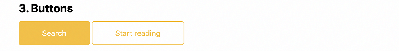
Both are called Benjamin… get it?
What new utilities did we use?
px-12/py-3→padding-leftandpadding-right/padding-upandpadding-bottombg-yellow-400→background-colorborder-yellow-400→border-colorhover:bg-yellow-300→background-coloron:hoverfocus:outline-none→background-coloron:focustext-white→colorrounded→border-radiusborder→border-widthtransition→transition(with a transition delay of 150ms)duration-300→transition-durationinline-block→display
Banner

What new utilities did we use?
bg-cover→background-sizeflex→displayitems-center→align-itemstext-shadow→ ❗This is a custom class I made, there is no text-shadow utility class on TailwindCSS❗
Category Card
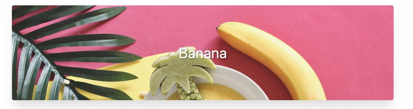
| <div class="h-48 rounded flex items-center justify-center bg-cover shadow-xl" | |
| style="background-image: url('<https://res.cloudinary.com/nico1711/image/upload/v1613324207/banana-meal.jpg>');"> | |
| <h2 class="text-3xl text-white text-shadow">Banana</h2> | |
| </div> |
This card peels amazing…
What new utilities did we use?
justify-center→justify-contentshadow-xl→box-shadow
Product Card

| <div class="flex bg-white shadow-xl rounded"> | |
| <img class="h-40 w-40 object-cover rounded-l" | |
| src="<https://res.cloudinary.com/nico1711/image/upload/v1613325168/mango.jpg>" | |
| alt="Mango"> | |
| <div class="flex flex-col justify-center p-5"> | |
| <h2 class="text-2xl font-bold">Mangonificent Product</h2> | |
| <p>Looks like a mango, works like a mango... it's actually a mango.</p> | |
| </div> | |
| </div> |
What new utilities did we use?
object-cover→object-fitflex-col→flex-directionp-5→paddingrounded-l→border-top-left-radiusandborder-bottom-left-radius
Party Card
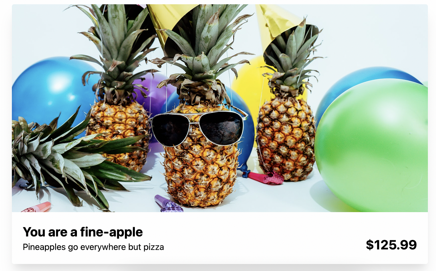
| <div class="shadow-xl rounded"> | |
| <img class="h-96 w-full object-cover rounded-t" | |
| src="<https://res.cloudinary.com/nico1711/image/upload/v1613326615/pineapple-party.jpg>" | |
| alt="Pineapple party"> | |
| <div class="p-5 flex justify-between items-end"> | |
| <div> | |
| <h2 class="text-2xl font-bold">You are a fine-apple</h2> | |
| <p>Pineapples go everywhere but pizza</p> | |
| </div> | |
| <h2 class="text-2xl font-bold">$179.99</h2> | |
| </div> | |
| </div> |
What new utilities did we use?
rounded-t→border-top-left-radiusandborder-top-right-radiusw-full→width: 100%items-end→align-items
Extracting components
All our refactoring will be in separate files called with the name of the specific component in the folder app/javascript/stylesheets/components.
Buttons
We will extract all the common classes from our buttons in the .btn class and create two specific classes (.btn-main and .btn-ghost) for the different versions of buttons we have.
And we are done! Congratulations!

👉🏻 Link to the Ruby on Rails application with all the components
PRESS ↑ ↑ ↓ ↓ ← → ← → b a FOR A SURPRISE !